Horton & Garton: eNewsletter header illustrations


Horton and Garton—estate agents based in Hammersmith, London—requested twelve attractive illustrative banners to head the monthly email newsletter sent out by their marketing team each month.
The illustrations needed to work as a cohesive series and also refer back to the Horton and Garton branding. They needed to provide a fun, slightly informal and human feel that would liven up the visual aspects of the newsletter and entice people to browse the articles contained within.
A predominately purple colour palette was chosen to reflect the brand colours, alongside a few contrasting colours where necessary. Monthly topics that subscribers could relate to were chosen as the basis for the illustrations in any given month. Care was taken to ensure that the illustrations were distinctive from each other, but still formed a series that complimented Horton and Garton's existing branding.
An HTML template for the newsletter was created that could accommodate the text, photographic and illustrative content in a clean, uncluttered and accessible way.
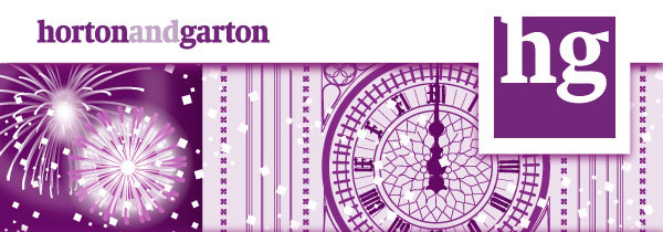
January: New Years
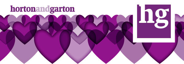
Feburary: Valentines Day
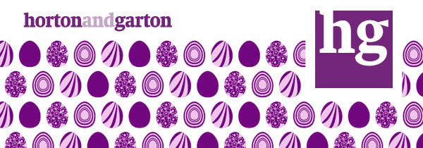
March: Easter Sunday
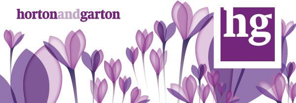
March: Easter Sunday
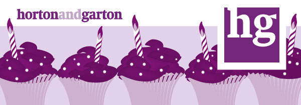
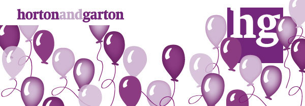
May: celebrating Horton and Garton's sixth anniversary
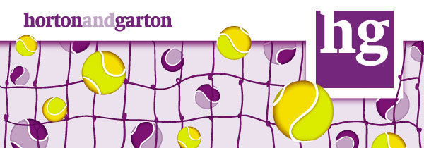
June: Wimbledon tennis tournament
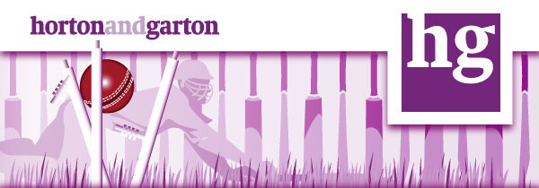
July: The Ashes cricket tournament
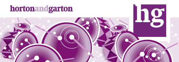
August: Notting Hill Carnival
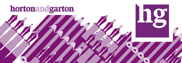
September: Back to school
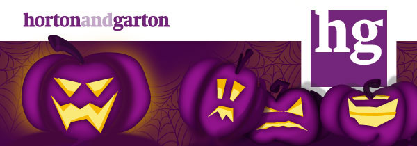
September: Back to school
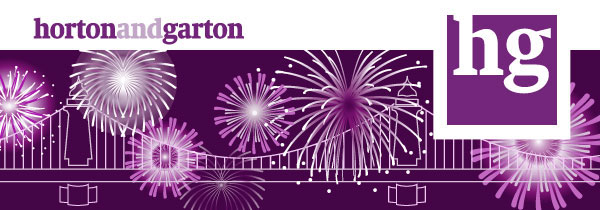
November: Guy Fawks/Firework/Bonfire Night
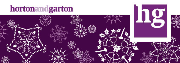
December: Christmas
More projects:
Passmore Edwards Portrait: linocut illustration
London Cornish Association: greetings card illustration
Hausmate Brochure: design and illustration
Letterpress Star Wars Prints
Vicobold Print: letterpress, illustration & printmaking
Flewitt & Sons Bakers Poster: linocut and letterpress
Al Shafie Miles Website: responsive web design
Letterpress cards: design, typesetting & printing
St Bride Foundation Flyer: letterpress & linocut
Ravenscourt Builders: logo and identity